overview
domains
content
population
traffic
navigation
demographics
methods
teledensity
ranks
divides
jargon
sources
lies & spin
industry
visualisation
analytics
pageviews |
 traffic
This
page examines internet traffic flows.
It covers
 introduction
The
2005 report
from telco statistics specialist TeleGeography claimed
"maturation" of the global information infrastructure
(GII) and
the net, suggesting that global cross-border internet
traffic grew by 49% in 2005, down from 103% in 2004. The
fastest growing regions - Asia (76%) and Latin America
(70%) - produced only modest traffic growth by the standards
of previous years. As of mid-2005 the combined average
traffic on all cross-border backbone routes was just under
1 Terabit per second (Tbps), projected to range from 2
to 3 Terabits per second by 2008.
That is a long way from the giddy 1990s, when pundits
proclaimed that domestic/international traffic was doubling
every hundred days and - more importantly - would continue
to do so into the forseeable future. Such proclamations
fuelled the dot-com bubble.
attention
Preceding
pages have highlighted the problematical nature of many
estimates about who is online and what they are doing.
In 2004 Nielsen-NetRatings claimed that during May the
average domestic surfer went online 30
times (for an overall time of 24 hours 16 minutes), encountering
1,013 web pages. The number of page views per session
was supposedly 34, with a mere 45 sessions being spent
at each page.
In June 2004 the top Australian 'residential user' destinations
for Nielsen's population were
Microsoft
(6.3m people for 2hrs 19m)
Google (4.2m for 30m)
Yahoo! (3.2m for 1hr 17m)
Telstra (2.5m for 18m)
eBay (2.2m for 1hr 41m)
Time Warner (1.9m for 1hr 13m)
the Federal Government (1.9m for 24m)
News Corporation (1.5m for 25m)
Fairfax (1.3m for 21m)
Commonwealth Bank (1.3m for 50m)
Other
metrics vendors have produced strikingly different figures
and there is disagreement about the interpretation of
'agreed' data.
It has for example been claimed that Telstra and Microsoft
get high rankings because MSN and BigPond are default
home pages and because time is spent downloading the latest
patch, searching directories or chatting.
bandwidth hogs
Figures on the percentage of overall traffic attributable
to particular content are contentious, with for example
claims that P2P users account for most of the data flowing
over the net.
In 2007 for example, as part of lobbying for FCC regulations
to require ISPs to more closely police their networks
for copyright infringements, NBC Universal complained
that the US government was "standing by mutely"
while the net was being "hijacked by bandwidth hogs."
It claimed that P2P accounted for 60% to 70% of all internet
traffic (with 90% of P2P traffic involving violation of
copyright).
That assertion was questioned. One 'broadband optimisation
service' claimed that http traffic had overtaken P2P traffic,
accounts for around 46% of all traffic with P2P at 37%,
followed by newsgroups (9%), non-http video streaming
(3%), gaming (2%) and VoIP (1%). Supposedly streaming
video represents 36% of all http traffic and streaming
audio 5%, with YouTube accounting for 20% of all http
traffic ("around 10% of all traffic on the Internet").
In 2007 German traffic management specialist ipoque claimed
that P2P applications account from between 50% and 90%
of all iInternet traffic, with BitTorrent involving between
50% to 75% of all P2P traffic and Skype responsible for
as much as 2% of traffic in some areas. Ellacoya Networks
claimed that P2P traffic accounts for 37% of North American
traffic, compared with 46% for http traffic (of which
a third consisted of streaming video).
traffic maps and directions
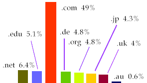
gTLD spaces (ie .com, .net, .org and .edu) continue to
account for more than half of destinations. Percentages
for late 2000 are as follows:
Akamai features an internet news mapping service that identifies current
appetite for news relative to average daily demand in
terms of millions of visits to 100 major news sites per
minute, per week, within six geographic regions.
studies
The Geography
of Cyberspace project supplies extensive maps and
diagrams that represent Internet traffic, the geographical
distribution of hosts and other features of cyberspace. It
also offers a useful bibliography.
For pointers to the direction of traffic and growth patterns
why not explore the Hoffman
& Novak research from Vanderbilt Uni about the
Web in 1995, the links on Hal Varian's
site, Matthew Zook's The Geography of the Internet
Industry (Oxford: Blackwell 2005) and his 1998
paper
on The Web of Consumption: The Spatial Organization
of the Internet Industry in the US for maps
of Internet traffic, the geographical distribution of
hosts and other features of cyberspace?
Netgraphs
provides pointers for statistics buffs. The Cooperative
Association for Internet Data Analysis (CAIDA)
has a large range of papers and reports on bandwidth,
transfer pricing and the nitty gritty of traffic between
telcos and ISPs.
Martin Dodge, leading cybergeographer, has an excellent
introduction
to mapping traffic and co-authored the outstanding Mapping
Cyberspace (London: Routledge 2000), which has a companion
site.
The Electronic Space Project (Espace)
at Michigan State University complements the Geography
project. We recommend Information Tectonics: Space,
Place & Technology In An Electronic Age (New York:
Wiley 2000) a collection of papers edited by Mark Wilson
& Kenneth Corey and the associated maps
of hosts and access to telecommunications.
Matthew Zook's 1998 paper
The Web of Consumption: The Spatial Organization of
the Internet Industry in the US provides a striking
demonstration of how the supposedly 'spaceless' Internet
industry is clustering in specific geographical locations,
in particular New York, LA and San Francisco. It is complemented
by NY University's project
on information technology and the future of the urban
environment, in particular the mapping.
Zook's mapping should not be a surprise to anyone who
has considered the location of the major newspapers, broadcasters
and publishers, though there's a more elaborate analysis
in Tendencies & Tensions of the Information Age:
The Production & Distribution of Information in the
United States (New Brunswick: Transaction 1997) by
Jorge Schement & Terry Curtis, building on Fritz Machlup's
pathbreaking Knowledge, Its Creation, Distribution
& Economic Significance (Princeton: Princeton
Uni Press 1984).
If price is not a consideration consult TeleGeography
2000 - Hubs & Spokes: A telegeography internet reader
(Washington: Telegeography 2000) a detailed report
from the consultancy of the same name. It is of particular
interest for its effort to map the various forecasts made
by Forrester, Jupiter, eMarketer and others.
We have pointed to other visualisation activity in the
final page of this guide.
'hottest' sites and search terms
Most search engines provide
periodic reports on the 'most popular' search terms and
searches, as distinct from destinations.
They are discussed in a supplementary note
that complements the more detailed examination of online
search behaviour.
 next page (navigation)
|
|